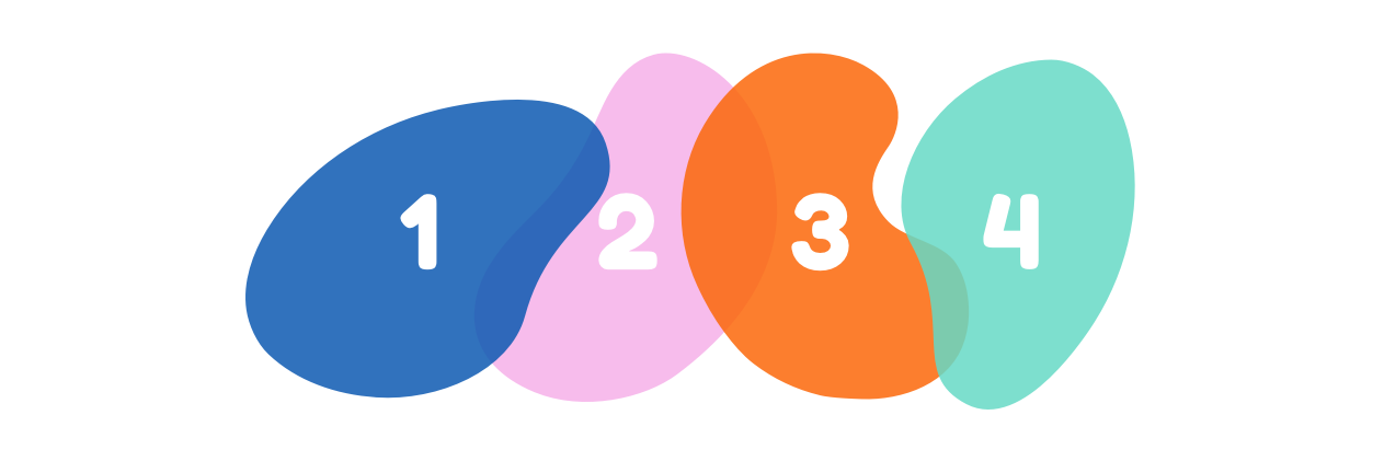
4 Fundamentals of a Top Tier Higher Ed Website
Ask yourself the following questions - these elements of an institutional website are critical for making sure your site is effective, relevant, and accessible.
1. Is your site accessible?
Even before evaluating design and content, the first question you should ask yourself is whether your audience - regardless of device or ability - can access your site.
Does your site stand up to ADA regulations? Despite the Americans with Disabilities Act being passed over 30 years ago, universities haven’t made a true commitment to inclusivity when it comes to ADA standards on the web. Only recently has a flurry of lawsuits1 put schools on notice. Though the threat of a lawsuit is very real, the loss of a huge potential customer base should be reason enough to treat ADA compliance very seriously.
It’s also critical that your site be responsive and mobile-friendly. Prospects often are visiting college sites on mobile devices2, so it’s imperative that content be accessible and readable. The design should hold up functionally and aesthetically, regardless of the device used to view it.
2. Is your site’s architecture helping or hurting?
Your school’s site can be beautifully designed with well-written content, but it will not be effective if your information architecture isn’t intuitive. Is it easy for your audience to find what they’re looking for on your site?
Good information architecture allows the user to find what they’re looking for with ease. Poor information architecture frustrates visitors, increases bounceback rates, and puts a strain on staff time when they have to respond to inquiries. Most prospective students are visiting your school’s website to research programs, request more information, and apply - is your site doing a good job of guiding them to these activities?
Assess your navigation menus and content organization. Looking at a map of all of your site’s pages can give you critical insight into the effectiveness of your content structure. Since students are typically comparing more than one school, this is not the time to get creative - navigation menu items should be easy to understand, standard, and traditional. Call to action items (such as “Apply”) should be in obvious, consistent places.
3. Is your content current, compelling, and aligned with your school’s message?
How effective is your content? Content that is compelling, consistent, current, and digestible is essential to your site’s success.
Your content is a chance to convey a clear message about what sets you apart from the competition. Your site’s content should showcase the culture and environment at your school. Publishing news and events on a regular basis is another way to convey a sense of experience.
Content should also be consistent and easy to digest. Segmenting content with a clear hierarchy makes it easier to read than walls of text. Consistency in voice and tone is important, and it can also help your audience orient themselves. Program pages should look especially consistent so that students can easily compare between them.
4. Is your design showcasing your school?
Visual design should convey the same tone that the site is attempting to message through text content. Does the site look modern and trustworthy? Sites that look old or have inconsistent design elements can turn users off or lead them to believe they’re not credible.
Branding should be distinct and obvious. Is the school’s logo placed consistently? Is it big enough to make an impact? Photography should be high-quality, captivating, and authentic.
Is your school’s site hitting the marks? Contact us for a copy of our “Site Quality Checklist”.
1 https://www.insidehighered.com/news/2018/12/10/fifty-colleges-sued-barrage-ada-lawsuits-over-web-accessibility
2 https://learn.ruffalonl.com/rs/395-EOG-977/images/2019_E_Expectations_Report__EM-011.pdf